For our AS students who are now back with us beginning their second year we set them a summer task to visit an exhibition! I've spent the morning compiling a list of suggestions (mostly London based) from my students and thought it might be handy to share with you all! I'm looking forward to attending the Royal Academy Summer Show next week as a trip for our students (Kirsty is attending too!) and I'm visiting Part 1 of New Designers. After those I'll need to start planning a few to visit over the summer. I've heard good things about Mona Hatoum at the Tate and am keen to check out Conceptual Art in Britain as well as Exhibitionism - if the Bowie exhibition at the V&A is anything to go by for an art/music collaborative show it's bound to be good! GRADUATE SHOWS
Art education and the use of social media has caused a bit of a stir lately but, for my department it really has made a difference in our students (and potential new students!) engagement and possibilities within Fine Art. This academic year has been the most challenging and rewarding of my teaching career so far and through the more difficult times I have been fortunate enough to gain continuous CPD through the Facebook group of NSEAD. It really is a fantastic resource and teachers from up and down the country are sharing inspiring ideas, resources and examples of excellence every single day. This site made me think about the new digital age and how it is now more relevant than ever to be seen and heard online. Social media really has made a massive difference in the promotion of my course and more importantly, made a significant impact on my students knowledge within the arts!
So, wondering where you start? Branding:
First things first - create a brand for yourselves! It is important for your students and others to recognise who you are and establish a connection. I created our own identity by making a logo and selecting a colour and font that would work best for us. We use our logo for everything - from signs around the department, open day events, taster sessions, briefs for students, social media sites, icons on emails, competitions such as the Saatchi, publicity for Reps, etc. It really does make a massive impact in drawing attention as to who we are as a department and highlighting attention to our students work.
Lastly, make your own tag so people can start locating your work and identifying you on multiple sites. Ours is fsfcfineart - we even have our own hashtag: #fsfcfineart!
Flickr: Some of you may remember Claire's wonderful series of posts on 'digital tools'. The blog gives you a real snapshot of what ticks our boxes in the world of digital media and how you can use it yourself to make your students learning experience more exciting. For us, Flickr was where everything began and we find it fab for sharing past/present work with our students and they can access it both at home and in college.
Additionally, you can create your own albums to categorise styles of artworks or split between year groups, final pieces and preparatory work. It also saves on time in taster sessions and instead of creating a PPT of student examples you can play your Flickr page on a continuous slide show to inspire learners. We even use it for Open day events and end of year exhibitions to create a real buzz within the department! Pinterest: This is old news nowadays but if you haven't got it - do! Pinterest really is the most incredible resource for the visual arts and students respond to it really well. On our Pinterest board we have created over 60 boards of artists and techniques that make us tingle with excitement and our students use the site successfully to share ideas and to inspire one another. Pinterest has allowed us to network with fellow teachers, students, businesses and galleries around the world and as a department we have over 1000 followers.
We have also made our own YBA (Young British Artist)board to showcase students work that we are a teeny bit envious of. It has been up and running for less than 6 months and already has nearly 700 followers. The images pinned are from our portfolio of student work on our Flickr page and additionally gives our students the possibility of building employability links and being contacted by potential artists and galleries interested in their work. It also lets our followers see who and what we are and helps build networking opportunities and relationships with brands such as Fujitsu.
Instagram:
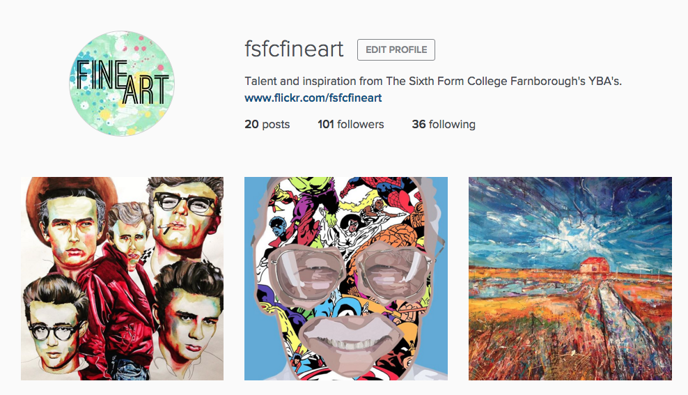
Instagram was initially recommended by one of my students and after a few discussions in class I found that several of my students were already using the social media site for their own publication of artwork and gaining huge successes from it. About three weeks ago, I decided to try a new digital venture for the department and since launching our own page we already have over 100 followers. Our students have responded positively to the site and many have followed us - checking daily to see new ideas from fellow students in both AS and A2. Through hashtags we have been able to create an online following and draw attention to what we want people to look at. For example: #fsfcfineart, #studentartwork #expressivepainting, etc. Our page has also enabled us to find new artists and follow galleries for inspiring artwork for our students. Our students can then click on what we 'like' and within the past week some students have already approached me through our online signposting for artist research!
It makes me incredibly proud to see my students receive the attention they deserve and even prouder to see them independently critique and compliment one another's artwork. In turn, this positive praise gives my students more confidence within the classroom and successfully introduces them to new initiatives and links within the art world.
Now, I won't lie.. the above does take time and we try to post on each social media site at least once a week to keep our audience happy. All of the above sites have an App and once set up it is pretty quick to post something from your phone and access it without a computer. We even have our own QR codes within the classroom for students to access in lessons and we publicise these also on our course leaflets and next to paintings around the college (linking back to our Flickr account).
We'd love to digitally interact with other educational institutions so if you use a digital tool for the promotion of your student artwork then let us know by either following us or leaving a comment on the end of this blog post!
why: having recently become a proud owner to two beautiful cats I wanted to celebrate by adding some artwork to my walls that was cat related and I stumbled upon Andy Warhol's cat series! You can read more about the 25 cats named Sam and one blue pussy, here. I was completely unaware of them before and they make a great link for any students looking at animals for a subject matter as well as being a bit away from the norm for an Andy Warhol reference! Also if you too are into cats and art and happen to be in Amsterdam I fully recommend the Cat Museum, The Cat Cabinet, that's there!
I'm currently doing a mini-portrait project with my year 7's for the end of term and we have been having some fun playing around with the starting point 'silhouette's' so I thought I'd share a few of the activities we have been doing! We started by creating a set of photographs so each student had a photo of themselves from a side view. From the photographs we made our initial silhouette. I got my students to create the silhouette by tracing around the outline of their figure onto tracing paper, cutting it out and then placing and cutting round it onto black paper! We then mounted them onto white cartridge!
Rather than just leaving it there though, I wanted to start to put more detail in! We are working up to creating a design on a ceramic tile so I wanted my students to create more layers of colour and more shapes to work with. We used grey paper to add sections of detail, focusing on things like hair, ears (if visible!) and clothing. I showed the students some examples of framed silhouettes too to inspire them to create a black paper-cut border.
Next we came back to drawing! We took the silhouettes out to our photocopier and I showed them how to create a positive/negative copy. The black areas are transformed to white enabling them to draw back into the silhouette shape. Working from their photograph they put back in the detail of their facial features, hair and clothing!
Then finally back out to the photocopier to create a second positive/negative copy this time reverting the image back to it's originally state! I also showed them how to do a one colour copy to liven it up a bit into some brighter colours! It's worth checking if your copier has this setting there's a whole range of colours to choose from - red, blue, yellow, orange, green etc. etc.
My students really enjoyed it and have made some exciting designs in preparation for our ceramic tiles! As always if you try out this technique we'd love to see what you and your students create!
This academic year has flown by and like many of you in Further Ed I can't believe we're about to start the exam unit! With this in mind I realised my attention lately has been on the job and that it was about time I focused on sharing ideas that I've discovered on my journey.
Some of you may have already heard of this App but it is literally amazing.. and I am a teeny bit jealous that it wasn't invented when I was studying art and design. Fragment App first came to my attention when it was iTunes 'App of the Month' and my colleague shared it with me. At first glance, I knew it would be some sort of photo editing software but I didn't realise the potential it had in the classroom!
Straight away I tested the software with some of my student's work (above image) and discovered that it was perfect for adding geometric patterns and shapes to images. I was instantly hooked and saw how it could revolutionize the development and experimentation of my student's work.
My students have responded to the App really well and I would say that in some cases it has saved their project work. Some of my students have created entire projects using the App and it is a brilliant way of getting digital work into a project quickly without the hassle of Photoshop.
Here are some of my suggestions as to how you could use the software in your classroom:
Initial Responses: Engaging students with different ways of how to view their images - especially those who are most suitable to abstraction!
Experimentations: Drawing, painting, collaging, weaving, layering, double exposures, etc.
Sculptures: Print, cut, images and turn into unique photographic sculptures.
Fragment App is available through the iTunes store and works on iPhones/iPads/Androids as well as desktops! The App does cost - but it's definitely worth the couple of pounds and if you have a department account then you only have to pay for it once.. yay!
So, what are you waiting for? Deliver it as an exciting new technique to your students over the next few weeks and make their exam project stand out!
Just a quick post to share my excitement with this technique! I love the idea of working with thread but not every student is going to be into the idea of sewing so if you've got any students like this get them to give this a go!
Drawing with thread & pva
what you need:
- embroidery floss (I used black but you can use any colour!)
- pva glue
- a flat plastic surface (I used a paint palette)
- glue stick or brush
method:
1. Pour a layer of pva into your palette (approx. 5mm thick) - you can pour and tilt your palette or push the glue around to make a particular shape that suits your drawing or go right to the edges for an even shape
2. Cut stripes of thread to work with - if your using embroidery floss experiment with separating the 6 strands into different thicknesses so that you can get a range of line in your drawing
3. lay the strands thread into the pva to create your drawing - if you can't get them in the right position use your glue stick or brush to push them into place. You can also create loose threads around your drawing by hanging them outside of the glue area!
note:the threads will start to sink into the pva and will look faint but the glue will dry clear so do not worry!
4. Once you have completed your drawing leave to dry! This could take 24-48 hours depending on the thickness of the glue!
5. Once completely dry carefully peel your drawing away from the palette to reveal!
extension: you could work into your drawing with machine or hand sewing OR cut away areas of glue to leave loose threads
tip: I used a slightly dirty paint palette (you could paint the palette before hand if you wanted more control over this aspect) - the pva will pick up the paint from the surface which can add an interesting effect to your drawing, if you want it to dry clear use a super clean one!
As always we'd love to see anything you create if you followed our instructions!
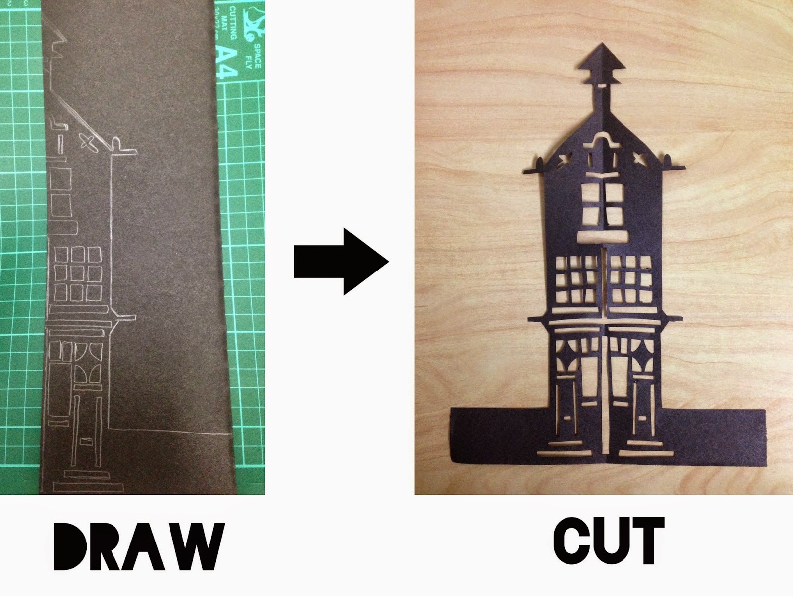
This morning I had an awesome lesson with my year 9's so I thought I would share it over here on I heart teaching art! We've just started an altered book project and to ease them in to manipulating paper I wanted to start 2D to build up their confidence. Both me and Kirsty have done a lesson on paper cutting recently but her's was aimed at year 12 - it's a great lesson that can be aimed at a range of levels you just need to play around with the level of skill and subject matter. We focused on buildings for our cuttings.
Starter: We watched a quick 4 minute clip of Rob Ryan talking about his work (you just can't do paper cutting without referring to him can you?! and the students loved it). I gave the students a very brief worksheet to fill in as we watched the video and afterwards discussed their opinions of the art work and how it had been created.
video clip: This is the clip that I selected, but there are a ton of different videos so you can easily adapt this to select a clip more relevant to your class!
Demonstration:I then demonstrated to the group how to create a symmetrical paper cut by folding the paper in half and drawing one half of the image. I found it was good at this stage to go over 'anchoring' the cut out areas and colouring in the sections that you wanted to cut out to make sure that it worked.
Main:Students will design and cut their own design based on buildings. I also provided my class with a range of examples (see below) so that they could get inspiration and if needed, copy sections of existing designs - for me this lesson was about learning the technique more than creating the design, that will come later! Once the students have got started it's best to go round and check designs, give guidance on how to cut and if there are any mistakes a few quick 'cheats' with some tape to fix it can always help!
Extension: For my higher ability learners, once they completed a paper cut (in super speedy time!) we discussed ways to make their existing design more complex OR began a second cutting this time working with a flat design rather than symmetrical and for the very advance students introduced typography (must be done back to front!) and shapes surrounding the design.
Plenary: If you have access to an old OHP then you can celebrate (woo-hoo!) cause it now has a super cool function! We gather around the OHP to exhibit our final paper cuts and as each student showcased theirs we ooo'd and aahh'd (as its bonfire night) and they discussed either a pro or con of paper cutting!
If you do have a go at this lesson as always we'd love to see the results!
- Claire ❤ (& Kirsty as I pinched some of her resources for my lesson and this post!)
My Fine Art students are currently transitioning into A2 and I have spent most of the past month introducing them new techniques that are easy and cheap to do! This post is going to introduce you to the wonderful world of acrylic transfers which are simply, a photographic transfer process that creates beautiful prints of your chosen image on to any acrylic painted surface. Across this week my students have tested the technique on paper, fabric, acetate and wood and all have produced some confident results! What I love about this technique is that any image is suitable - it works in both black and white / colour (inkjet or laser printed!) and it can be developed further as backgrounds or into interesting textural collages like the work of Rauschenberg or Sally Mankus. Follow my easy how to, to get started...
Once the transfer has been rubbed off to reveal your final result consider the following ideas:
1. Acrylic transfers with different coloured paints
2. Drawing / painting into acrylic transfers
3. Creating transfers on different materials other than paper e.g. wood, plastic, cardboard...
4. Experimenting with scale, repetition and layers to create a mixed-media collage!
Here are some of my student responses and as always if you have tried this technique then we would love to see some of your own/student examples!
Friday last week myself, a colleague and 30 AS Fine Art students from The Farnborough Sixth Form College ventured up to London to The Saatchi Gallery. I always love this time of year as it's great transition period to the A2 year and we thought what a perfect opportunity to look at inspiring art, generate ideas and take part in some workshops!
First on our list was a guided tour around The Saatchi at 11am. We had the privilege of being shown a selection of work from their new exhibition: 'Pangaea: New Art From Africa and Latin America'. The most striking piece of work was without doubt artist Rafael Gómezbarros work entitled 'Casa Tomada'. The students and myself were in awe of the space and couldn't take our eyes of the packs of giant ants filling the room around us. For those of you who don't know, the ant's bodies are actually made up of two human skull casts which sent a shiver down everyone's back! The work really made the student's think about what life consists of and that each ant's body could of represented them.
We were also shown the work of their youngest artist in the gallery Ibrahim Mahama and after climbing up to gallery space 10 we were not dissapointed. Ibrahim is 26 and his work is familiar to that of Christo. He normally produces land art and was specially commissioner to fill the room in the gallery with draped jute sacks. Each sack represents the demands of goods such as cocoa and symbolises the difficult conditions traders face in African markets. The installation is set in a dull-lit wooden room with each sack dissembled. At first glance you are overwhelmed by the pure size of the installation and then you begin to notice the small imperfections, marks and traces that each cocoa sack hold. The students were completely silent and everyone took in the reality of what lives as porters must be like in our current economy.
Lastly, we were shown the work by Oscar Murillo - the galleries second youngest artist. Again, food was a common theme within Oscar's work and his expressive works were familiar to that of Rauschenberg's collages. Oscar Murillo was born in Colombia and at a young age emigrated to London: his work encompasses the difficulties of conforming to a new culture and changing his mother tongue. Before working on each piece Oscar likes to create a dirty canvas by leaving his assemblages of recycled materials on the floor for people to walk on to - or simply to collect dust and dirt. When the students looked closely they began to see basketball traces on the walls and hidden messages in the form of QR codes which was great fun scanning on our phones!
The Education team at The Saatchi were fantastic and made the experience of a gallery visit fun for all. The tour was informative and inquisitive and inspired the students for the artist workshop which was our next step with artist Daryll Hawkins. Daryll immediately took us up to the top floor to see the work of artist David Koloane. The students were asked what age they thought the artist was and all were shocked at the response of 76. Koloane's work is expressive and have somewhat a naivety to them. The marks and colour are worked up into an electrifying beauty that represents the everyday buzz of commuting, high speed traffic and mass protests within his home country South Africa. Student's responded well to Daryll's demonstration of Diskiology II and began to create their own A1 responses to Koloane's work in charcoal and pastel. The student's listened to music from Spotify and asked Daryll questions about art school and what to expect. They responded well to an artist approach and really enjoyed creating artwork that wasn't part of their own assessment - it was a real pleasure to see my class of 2014 engage so much with materials!
The day ended with a final workshop ran by the Education Team at the gallery. I was expecting a theoretical based workshop so was pleasantly surprised to find out it was another practical session! This time round student's got to re-cap the work of Oscar Murillo and presented on the floor in front of them was a pile of plain paper. Student's were asked to work collaboratively to create their own distorted canvas and then ... (yep - you guessed it!) ... their own dirty canvas. They crushed charcoal with their feet before jumping, stamping and dancing on top of the joint canvas.
It was fantastic to see them all enjoy themselves and learn a new engaging process. After all that exercising students worked in small groups to create their own art work based on a food. The student's loved working as a group - something which can rarely be done in the classroom and groups embraced sharing issues they face/d with language, culture and icons. One student even decided to use her left over Capri-Sun from lunch and cut into the existing artwork! Students were questioned into the meaning behind their piece and asked to title their work before ending the day at 2:30pm.
Overall, the day was a truly inspiring and fun experience. The Education Team were fab and fully supported the students all day - stretching their learning where possible. My student's learnt new experiences that I hope they will extract into their own work in the classroom and it was great to see them view real artwork in a beautiful and accommodating gallery. I would highly recommend taking your student's to The Saatchi if you haven't already - exhibitions are free and we only had to pay for the first artist workshop (which was definately worth the price!) They even link the Art and Design exam themes to their exhibitions so if you're running out of time now to make a visit then I would jump at the chance to go with your students in February. I left feeling inspired and can't wait to test my observations of the day with my classes!
I don't know about you but I always find myself continuously racking my brains for innovative ideas of how to successfully embed literacy and maths within the arts. Visual literacy is an area that has always interested me and believe it is a great, creative way to develop student's learning. Recently, for an observed lesson I chucked myself in the deep end and created a starter activity inspired by this fantastic resource from The Photographers' Gallery entitled: What do you see? The concept of the activity is that it is designed to develop learners visual literacy skills by asking them to describe and draw the subject and compositional elements of a photograph. This idea was perfect as I was fortunate enough that my students at the time were responding to primary photographs!
I'm even luckier that most of my classes have a perfect match to work in pairs but if not don't worry - three's can work too. Just double the drawer or the describer up. You can make the activity as long or short as you like - I gave mine two minutes each to describe/draw as I enjoy short and sharp activities!
Step 1. Find a partner
Step 2. Swop your primary photographs with your partner and choose one image you would like your partner to draw - keep it hidden from your partner!
Step 3. Start describing the
photograph to your partner without showing the image. The partner must
try to draw the image based on your description. You may ask questions
of each other, act out poses and look at the drawing together as long as
the photograph is kept hidden.
Step 4. Now, swop and repeat the process.
Step 5. Lay out the drawings next to the photograph and compare them.
The students really engaged with the activity and it was great to see the drawer acting out poses to understand verbal descriptions/instructions! The responses after the activity were all positive and some were surprised at how quickly they could produce a detailed drawing through the use of language. At the end of the activity I got students to respond to three set questions:
1. How do the drawings compare with the original photographs?
2. Did your partner describe any details in the photograph you may not of originally noticed?
3.What descriptive words did you find most useful when listening to instructions?
Feedback from learners was positive and all were able to confidently answer the 3 questions above. Even better, students were able to comment that it enabled them to see parts of the image which they may of not noticed beforehand. For example: texture, line, elements within the back/foreground. After the activity I got my students to continue responding to their primary photographs - making sure they applied the skills they had learnt from the activity to notice every, tiny detail. Some were even repeating the descriptive words to remember how to draw marks!
Overall, I found this activity ensured accurate observation and students understood what they were seeing/drawing which resulted in higher-level critical thinking! We think this activity is great for any art discipline and would work well with paintings/drawings etc as well as photographs. The feedback could even be changed into a critique!
As always let us know if you have tried this activity or have other fun ways of using visual literacy in your lessons. We'd love to hear them!
I love doing observational drawing lessons with students! I studied Drawing at degree level so I particularly enjoy the introduction lesson as I introduce drawing approaches that I have found work for me. I don't know about you but I always find I get a good portion of students who are fearful of drawing and who proclaim 'I can't draw' or something of the like, so I like to do this lesson to warm them up and build their confidence in their drawing skills. Instead of jumping in with a technical approach focusing on perspective I like to introduce a series of activities that focus on training their co-ordination between their hands and eyes. I feel it's a great way to introduce drawing that will lead to a better understanding when they move onto more technical approaches but I also feel there are some students (myself included) who will never use a technical approach because it just doesn't work for them - but they can learn perspective by eye instead!
The image above is from a recent observational drawing lesson I did with students but is typical of the way I structure the session. I like to start with quick studies, I'm talking 30 seconds-2 minutes, before moving on to longer studies and I always use a range of approaches. I like to use contour drawing, continuous line, blind drawing, negative space and wrong hand drawing. I'll normally do quick demonstrations on the white board, smart board, flip chart, what ever I have access too but I also like to refer to artists who use these techniques so I put together the sheet below (available to download from our TES resources, HERE) which shows artists and the techniques used! I normally set students homework to make notes about the techniques in their sketchbooks following the drawing lesson and to do further research on one of the artists.
As always we'd love to here from you if you use similar approaches or if you have a go using ours in the classroom!
- Claire ❤
We've already posted about our A2 exam theme resources and linked to the brilliant ones others have created but let's not forget AS! Above is the video intro we used for AS Graphics which outlines the briefs we're setting and the artists/designers we'd suggest researching for it. Below are some additional resources from a range of fabulous people that we've found online...
You can click through to view all our AS exam 2013 posts, HERE and A2 exam 2013 posts, HERE. We're on Edexcel so that's what we've resourced for but there's a lot of stuff out there for AQA and OCR too andArt2dayandSaatchiare great places to start looking!
- Claire ❤
I love this time of year! For me the exam theme is exciting it's the only time you have a really restricted time period in which to create resources and the key thing that can take a while to decide on, the theme, is decided for you by the powers that be! We deliver A Level Graphic Communication, Textiles, Photography and Fine Art between us so we've got a few resources together to share and we've been hunting around online too to find the best stuff that's out there. For Graphics I love a video intro, I've posted about them before, they are really easy to put together. I created mine straight from the powerpoint I'd already put together by exporting the slides as .jpeg files then placing them into iMovie, adding a bit of music and then you've got something to give the intro a bit of a pop (and a slide for students to pour over and digest a bit slower in their own time!). It also give a quick overview to how we've interpreted the themes and the artists/designers we're looking at in graphics. What I like about the exam unit is that the further you get through it the more resources you can find so I've put together a quick set of links to what I think is the most exciting stuff out there online being shared! Keep checking back to this post as we'll add to it each time we find something new...
You can click through to view all our AS exam 2013 posts, HERE and A2 exam 2013 posts, HERE. We're on Edexcel so that's what we've resourced for but there's a lot of stuff out there for AQA and OCR too and Art2day and Saatchi are great places to start looking!




.jpg)