Inspired by the great Mrs Arty Textiles I decided to finally test out literacy jenga this week with my A2 classes to push the use of educational gaming and make literacy more appealing and less daunting. I'm also a huge lover of independent learning and believe strongly that they my students should be coming up with their own innovative ideas as practicing artists so took the opportunity to test the much loved family game with target setting.
Within my current SOW we are currently reaching the end of initial responses and I find that students can sometimes miss the important elements from their artists. So, before it was too late we started with a brief peer response and focused on descriptive language. I have recently found the fantastic App Wordswag and use it for making engaging visuals within lessons. The students love it and since the use of the App I have found that they have become more focused on specific tasks and are able to respond to questioning more confidently. I also use the App for projecting homework at the end of a lesson and hope that my students become more excited about the thought of extension tasks.
After this initial activity I split the class into groups of 4-5 and each group received a 'literacy jenga' pack with visual, technical and descriptive keywords on it. My classes like competing against one another and taking part in 'Art Olympics' so it was great to see 17-18 year olds so enthralled in stacking the game together. Once the jenga was constructed each student took it in turns to pick out a keyword and write it on the template above. As a group, we continued until each person had either 4 keywords each or the tower block tumbled!
It was fantastic to watch each group racing to write language down and taking risks at how the 3D form could balance on one block. The students then used the words to independently set themselves targets (one for that lesson) and embedded the keyword within a to-do list. Within that lesson I saw a huge improvement in the quality of written work and it was great to see all learners still actively using the sheet in follow-up lessons and within their analysis of preparatory work.
At the end of the lesson students returned to their original partner from the descriptive language activity and assessed if they had achieved their target from 1-10. Much to my surprise all students in the class were above halfway and all had confident explanations as to how they had met their target and improved developmental work in just 35 minutes. The pace and quality of work that was produced in this lesson was brilliant and my learners are participating more actively in independent work within 24 hours!
The literacy buzz is catching and it's already going around the rest of the department that my classes have been playing jenga in lessons. I love that my students are willingly producing more written work from this activity and I can't wait to test the game out again but with a different take. We'd love to collaborate/share resources with other teachers so if you are interested in making words more engaging within art and design then leave a comment below #literacyjenga.
Art education and the use of social media has caused a bit of a stir lately but, for my department it really has made a difference in our students (and potential new students!) engagement and possibilities within Fine Art. This academic year has been the most challenging and rewarding of my teaching career so far and through the more difficult times I have been fortunate enough to gain continuous CPD through the Facebook group of NSEAD. It really is a fantastic resource and teachers from up and down the country are sharing inspiring ideas, resources and examples of excellence every single day. This site made me think about the new digital age and how it is now more relevant than ever to be seen and heard online. Social media really has made a massive difference in the promotion of my course and more importantly, made a significant impact on my students knowledge within the arts!
So, wondering where you start? Branding:
First things first - create a brand for yourselves! It is important for your students and others to recognise who you are and establish a connection. I created our own identity by making a logo and selecting a colour and font that would work best for us. We use our logo for everything - from signs around the department, open day events, taster sessions, briefs for students, social media sites, icons on emails, competitions such as the Saatchi, publicity for Reps, etc. It really does make a massive impact in drawing attention as to who we are as a department and highlighting attention to our students work.
Lastly, make your own tag so people can start locating your work and identifying you on multiple sites. Ours is fsfcfineart - we even have our own hashtag: #fsfcfineart!
Flickr: Some of you may remember Claire's wonderful series of posts on 'digital tools'. The blog gives you a real snapshot of what ticks our boxes in the world of digital media and how you can use it yourself to make your students learning experience more exciting. For us, Flickr was where everything began and we find it fab for sharing past/present work with our students and they can access it both at home and in college.
Additionally, you can create your own albums to categorise styles of artworks or split between year groups, final pieces and preparatory work. It also saves on time in taster sessions and instead of creating a PPT of student examples you can play your Flickr page on a continuous slide show to inspire learners. We even use it for Open day events and end of year exhibitions to create a real buzz within the department! Pinterest: This is old news nowadays but if you haven't got it - do! Pinterest really is the most incredible resource for the visual arts and students respond to it really well. On our Pinterest board we have created over 60 boards of artists and techniques that make us tingle with excitement and our students use the site successfully to share ideas and to inspire one another. Pinterest has allowed us to network with fellow teachers, students, businesses and galleries around the world and as a department we have over 1000 followers.
We have also made our own YBA (Young British Artist)board to showcase students work that we are a teeny bit envious of. It has been up and running for less than 6 months and already has nearly 700 followers. The images pinned are from our portfolio of student work on our Flickr page and additionally gives our students the possibility of building employability links and being contacted by potential artists and galleries interested in their work. It also lets our followers see who and what we are and helps build networking opportunities and relationships with brands such as Fujitsu.
Instagram:
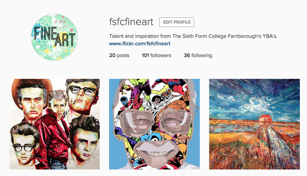
Instagram was initially recommended by one of my students and after a few discussions in class I found that several of my students were already using the social media site for their own publication of artwork and gaining huge successes from it. About three weeks ago, I decided to try a new digital venture for the department and since launching our own page we already have over 100 followers. Our students have responded positively to the site and many have followed us - checking daily to see new ideas from fellow students in both AS and A2. Through hashtags we have been able to create an online following and draw attention to what we want people to look at. For example: #fsfcfineart, #studentartwork #expressivepainting, etc. Our page has also enabled us to find new artists and follow galleries for inspiring artwork for our students. Our students can then click on what we 'like' and within the past week some students have already approached me through our online signposting for artist research!
It makes me incredibly proud to see my students receive the attention they deserve and even prouder to see them independently critique and compliment one another's artwork. In turn, this positive praise gives my students more confidence within the classroom and successfully introduces them to new initiatives and links within the art world.
Now, I won't lie.. the above does take time and we try to post on each social media site at least once a week to keep our audience happy. All of the above sites have an App and once set up it is pretty quick to post something from your phone and access it without a computer. We even have our own QR codes within the classroom for students to access in lessons and we publicise these also on our course leaflets and next to paintings around the college (linking back to our Flickr account).
We'd love to digitally interact with other educational institutions so if you use a digital tool for the promotion of your student artwork then let us know by either following us or leaving a comment on the end of this blog post!
A few months back Claire did a post about monoprinting with leaves and experimenting with using natural forms as resist. I've always loved monoprinting but for some reason my learners have never seemed to of engaged with the technique. For the past 6 weeks I have been teaching my AS Fine Art students a series of creative techniques before they take the plunge into their first project and the following technique captured their imaginations and enabled them to build and draw upon exciting layers!
Over the Summer myself and Claire were super lucky to find this idea on the NSEAD Online Facebook group. If you aren't a member then join - the wealth of resources shared with all levels of art educators is amazing. After a bit of a play with the technique I thought about how I could make it more advance for my students and this is where I experimented with masking tape layers and washes to build up the texture and tone within the print. This technique would work well for any initial responses or as a quick method of recording to change the direction of a project and more importantly all my students relished in getting messy, testing alternative drawing methods and combining medias!
Follow the below steps to give it a go with your classes this month...
What you need:
• Block Printing ink (water or oil based)
• Print rollers
• Acrylic paint
• Masking tape
• Newspaper / Magazines
• Cardboard or any mixed-media base
• Relevant imagery to monoprint / draw on top of
Method:
1) Take your base (cardboard works great as it enables your students to work on top of a new exciting media) and choose a light colour of acrylic paint to work on top of. It is important it is light so that the print and layers you are about to build up stay clear. I told my students to ensure the colour reflected the mood of the image they were studying or you could link it to colour theory. Dry with a hairdryer before proceeding to step 2.
2) Start to build up layers with masking tape - thinking about the direction and scale of strips applied. I taught my students a technique called 'masking tape transfer' to add more depth to their base. To create this technique, simply apply masking tape directly onto any printed image (magazines, newspapers, train tickets, etc work great due to the quality of the ink!). Once stuck firmly down to the image/text - simply peel straight off! You will be left with the ink on the tape and what's great is that the masking tape is still sticky and can be applied straight on top of your base.
3) Apply a thin wash of white acrylic paint on top of the masking tape layer to ensure your print will stand out.
4) Roll your ink on to the back of a printed image (make sure your image is mirrored so it comes out the right way!) and rub off the excess ink with spare newspaper. I used black ink so it made a real contrast to the yellow background layer but you could experiment with single/multiple colour ways! Once you have rubbed the excess ink off, place the inked image face down on top of your masking tape base and start tracing on top of your image with a biro or sharp pencil. Once you have completed your drawing remove the printed image and ta-dah! You have been left with a unique and experimental printed drawing like below.
Tip: Less ink is more and the sharper your drawing implement the better! Biro's are great. My students responded to a variety of mark making techniques and extended their learning by using creative drawing methods such as continuous line and adding tea/coffee into their prints for further use of layers/tone.
As always we'd love to see visual examples if you give this technique a try with your students and if you know any other creative printing techniques then contact us to make a guest blog appearance.
This academic year has flown by and like many of you in Further Ed I can't believe we're about to start the exam unit! With this in mind I realised my attention lately has been on the job and that it was about time I focused on sharing ideas that I've discovered on my journey.
Some of you may have already heard of this App but it is literally amazing.. and I am a teeny bit jealous that it wasn't invented when I was studying art and design. Fragment App first came to my attention when it was iTunes 'App of the Month' and my colleague shared it with me. At first glance, I knew it would be some sort of photo editing software but I didn't realise the potential it had in the classroom!
Straight away I tested the software with some of my student's work (above image) and discovered that it was perfect for adding geometric patterns and shapes to images. I was instantly hooked and saw how it could revolutionize the development and experimentation of my student's work.
My students have responded to the App really well and I would say that in some cases it has saved their project work. Some of my students have created entire projects using the App and it is a brilliant way of getting digital work into a project quickly without the hassle of Photoshop.
Here are some of my suggestions as to how you could use the software in your classroom:
Initial Responses: Engaging students with different ways of how to view their images - especially those who are most suitable to abstraction!
Experimentations: Drawing, painting, collaging, weaving, layering, double exposures, etc.
Sculptures: Print, cut, images and turn into unique photographic sculptures.
Fragment App is available through the iTunes store and works on iPhones/iPads/Androids as well as desktops! The App does cost - but it's definitely worth the couple of pounds and if you have a department account then you only have to pay for it once.. yay!
So, what are you waiting for? Deliver it as an exciting new technique to your students over the next few weeks and make their exam project stand out!
My Fine Art students are currently transitioning into A2 and I have spent most of the past month introducing them new techniques that are easy and cheap to do! This post is going to introduce you to the wonderful world of acrylic transfers which are simply, a photographic transfer process that creates beautiful prints of your chosen image on to any acrylic painted surface. Across this week my students have tested the technique on paper, fabric, acetate and wood and all have produced some confident results! What I love about this technique is that any image is suitable - it works in both black and white / colour (inkjet or laser printed!) and it can be developed further as backgrounds or into interesting textural collages like the work of Rauschenberg or Sally Mankus. Follow my easy how to, to get started...
Once the transfer has been rubbed off to reveal your final result consider the following ideas:
1. Acrylic transfers with different coloured paints
2. Drawing / painting into acrylic transfers
3. Creating transfers on different materials other than paper e.g. wood, plastic, cardboard...
4. Experimenting with scale, repetition and layers to create a mixed-media collage!
Here are some of my student responses and as always if you have tried this technique then we would love to see some of your own/student examples!
Friday last week myself, a colleague and 30 AS Fine Art students from The Farnborough Sixth Form College ventured up to London to The Saatchi Gallery. I always love this time of year as it's great transition period to the A2 year and we thought what a perfect opportunity to look at inspiring art, generate ideas and take part in some workshops!
First on our list was a guided tour around The Saatchi at 11am. We had the privilege of being shown a selection of work from their new exhibition: 'Pangaea: New Art From Africa and Latin America'. The most striking piece of work was without doubt artist Rafael Gómezbarros work entitled 'Casa Tomada'. The students and myself were in awe of the space and couldn't take our eyes of the packs of giant ants filling the room around us. For those of you who don't know, the ant's bodies are actually made up of two human skull casts which sent a shiver down everyone's back! The work really made the student's think about what life consists of and that each ant's body could of represented them.
We were also shown the work of their youngest artist in the gallery Ibrahim Mahama and after climbing up to gallery space 10 we were not dissapointed. Ibrahim is 26 and his work is familiar to that of Christo. He normally produces land art and was specially commissioner to fill the room in the gallery with draped jute sacks. Each sack represents the demands of goods such as cocoa and symbolises the difficult conditions traders face in African markets. The installation is set in a dull-lit wooden room with each sack dissembled. At first glance you are overwhelmed by the pure size of the installation and then you begin to notice the small imperfections, marks and traces that each cocoa sack hold. The students were completely silent and everyone took in the reality of what lives as porters must be like in our current economy.
Lastly, we were shown the work by Oscar Murillo - the galleries second youngest artist. Again, food was a common theme within Oscar's work and his expressive works were familiar to that of Rauschenberg's collages. Oscar Murillo was born in Colombia and at a young age emigrated to London: his work encompasses the difficulties of conforming to a new culture and changing his mother tongue. Before working on each piece Oscar likes to create a dirty canvas by leaving his assemblages of recycled materials on the floor for people to walk on to - or simply to collect dust and dirt. When the students looked closely they began to see basketball traces on the walls and hidden messages in the form of QR codes which was great fun scanning on our phones!
The Education team at The Saatchi were fantastic and made the experience of a gallery visit fun for all. The tour was informative and inquisitive and inspired the students for the artist workshop which was our next step with artist Daryll Hawkins. Daryll immediately took us up to the top floor to see the work of artist David Koloane. The students were asked what age they thought the artist was and all were shocked at the response of 76. Koloane's work is expressive and have somewhat a naivety to them. The marks and colour are worked up into an electrifying beauty that represents the everyday buzz of commuting, high speed traffic and mass protests within his home country South Africa. Student's responded well to Daryll's demonstration of Diskiology II and began to create their own A1 responses to Koloane's work in charcoal and pastel. The student's listened to music from Spotify and asked Daryll questions about art school and what to expect. They responded well to an artist approach and really enjoyed creating artwork that wasn't part of their own assessment - it was a real pleasure to see my class of 2014 engage so much with materials!
The day ended with a final workshop ran by the Education Team at the gallery. I was expecting a theoretical based workshop so was pleasantly surprised to find out it was another practical session! This time round student's got to re-cap the work of Oscar Murillo and presented on the floor in front of them was a pile of plain paper. Student's were asked to work collaboratively to create their own distorted canvas and then ... (yep - you guessed it!) ... their own dirty canvas. They crushed charcoal with their feet before jumping, stamping and dancing on top of the joint canvas.
It was fantastic to see them all enjoy themselves and learn a new engaging process. After all that exercising students worked in small groups to create their own art work based on a food. The student's loved working as a group - something which can rarely be done in the classroom and groups embraced sharing issues they face/d with language, culture and icons. One student even decided to use her left over Capri-Sun from lunch and cut into the existing artwork! Students were questioned into the meaning behind their piece and asked to title their work before ending the day at 2:30pm.
Overall, the day was a truly inspiring and fun experience. The Education Team were fab and fully supported the students all day - stretching their learning where possible. My student's learnt new experiences that I hope they will extract into their own work in the classroom and it was great to see them view real artwork in a beautiful and accommodating gallery. I would highly recommend taking your student's to The Saatchi if you haven't already - exhibitions are free and we only had to pay for the first artist workshop (which was definately worth the price!) They even link the Art and Design exam themes to their exhibitions so if you're running out of time now to make a visit then I would jump at the chance to go with your students in February. I left feeling inspired and can't wait to test my observations of the day with my classes!
During half term me and Kirsty received a rather exciting email from the wonderful Debbie Bliss. We have always been big fans of her knitwear and yarn ranges and I had met Debbie a few years back at a blogging event for Christmas Jumper Day with Save The Children so we were certainly intrigued when her email appeared in our inbox. Anyway it turns out that over at Debbie Bliss they have been busy creating a homeware range so they sent us over a few bits and pieces and it certainly does not disappoint! We had a bit of fun in the photo studio at work photographing them and here's our favourtie shots of the stuff we got...
These pieces are from the stitches collection. I think our absolute favourites are the mugs which don't just have beautiful illustrations of knit stitches but include the pattern itself on the inside of the mugs and of course are perfect for us teachers to pop a hot (or cold in Kirsty's case) drink in of a break time! We also enjoyed matching them up with some of the Debbie Bliss pieces I've knitted myself...
The monochrome collection is just as delightful as the stitches collection, we particularly love the knitting aid pieces. The apron is brilliant! We're not going to lie it took us a moment to work out why half of it appeared to be upside down, until we popped them on...a-ha! You can read it when you're wearing it! The information includes everything from knitting needle gauges to washing care instructions and even includes a couple of handy rulers (both inches and cm). This week we were hanging our summer exhibition so the pouches on our aprons came in very handy for storing hammers, nails, measuring tapes and the like whilst we were clambering up and down ladders! We also loved the London Brick Knitting Needle Holder, personally I find knitting needles a pain to store and display and this holder makes it all better and much more beautiful.
We hope you've enjoyed checking out this beautiful collection, as a knitter I am completely in love with these collections I would wholeheartedly recommend them as the perfect gift for your knitting friends! You can check out the full homeware range, HERE
I don't know about you but I always find myself continuously racking my brains for innovative ideas of how to successfully embed literacy and maths within the arts. Visual literacy is an area that has always interested me and believe it is a great, creative way to develop student's learning. Recently, for an observed lesson I chucked myself in the deep end and created a starter activity inspired by this fantastic resource from The Photographers' Gallery entitled: What do you see? The concept of the activity is that it is designed to develop learners visual literacy skills by asking them to describe and draw the subject and compositional elements of a photograph. This idea was perfect as I was fortunate enough that my students at the time were responding to primary photographs!
I'm even luckier that most of my classes have a perfect match to work in pairs but if not don't worry - three's can work too. Just double the drawer or the describer up. You can make the activity as long or short as you like - I gave mine two minutes each to describe/draw as I enjoy short and sharp activities!
Step 1. Find a partner
Step 2. Swop your primary photographs with your partner and choose one image you would like your partner to draw - keep it hidden from your partner!
Step 3. Start describing the
photograph to your partner without showing the image. The partner must
try to draw the image based on your description. You may ask questions
of each other, act out poses and look at the drawing together as long as
the photograph is kept hidden.
Step 4. Now, swop and repeat the process.
Step 5. Lay out the drawings next to the photograph and compare them.
The students really engaged with the activity and it was great to see the drawer acting out poses to understand verbal descriptions/instructions! The responses after the activity were all positive and some were surprised at how quickly they could produce a detailed drawing through the use of language. At the end of the activity I got students to respond to three set questions:
1. How do the drawings compare with the original photographs?
2. Did your partner describe any details in the photograph you may not of originally noticed?
3.What descriptive words did you find most useful when listening to instructions?
Feedback from learners was positive and all were able to confidently answer the 3 questions above. Even better, students were able to comment that it enabled them to see parts of the image which they may of not noticed beforehand. For example: texture, line, elements within the back/foreground. After the activity I got my students to continue responding to their primary photographs - making sure they applied the skills they had learnt from the activity to notice every, tiny detail. Some were even repeating the descriptive words to remember how to draw marks!
Overall, I found this activity ensured accurate observation and students understood what they were seeing/drawing which resulted in higher-level critical thinking! We think this activity is great for any art discipline and would work well with paintings/drawings etc as well as photographs. The feedback could even be changed into a critique!
As always let us know if you have tried this activity or have other fun ways of using visual literacy in your lessons. We'd love to hear them!
It's been a while since we've done a post so I thought I would share a
recent photographic collage lesson from one of my A Level Photography
classes. It was an enjoyable lesson to teach and the students all got
high results from the various techniques and even recorded their
creative process into stop animations!
With only 4 college weeks to go until my students exam (how quick does time go!)
I needed to find a new photographic technique that would push their
practice. I don't know about you but I find when your over the halfway
point of projects some students have a tendency to want to 'stick' to
one idea. I needed to break away from this quickly and the following
activities did just that!
To start the lesson I gave each student a found photograph and told them they had 5 minutes to rip up the image into any shape or size. Once they had destroyed the original image they were then instructed to throw all pieces of the torn photograph into the air and let them land on the paper provided in front of them. All pieces of the photograph were to be glued in their 'fixed' state and upon completion all students were posed with the question 'What have you just made?' Luckily, all my students recognised that they had just made a collage but more importantly the starter activity really got my students thinking (whilst making) which resulted in strong, relevant discussions!
I then did a quick demonstration of each three activities above and placed the students into groups. Our lessons are an hour and a half each so I was fortunate to split each activity into a rotation of twenty minutes which in terms of timing was spot on for each task! The whole point of the lesson was to get students to see their photographs in a different light and I found 20 minutes enabled students to create an experimental outcome that let them just create and not worry about why they were doing it. At the end of each 20 minutes we stopped, looked at work and discussed briefly processes that were working well and what could the next group do differently to improve that task. Whilst each task was underway each group also had an iPad and used the app iMotionHD. iMotion HD is basically a stop-motion app for any ios based system and allows you to record video which is then made into timed stop motion animations. The app is fantastic and I love how it records students development as well as allowing them to start viewing their work as moving images!
This lesson will leave each student with a minimum of 4 photographic collages and 2 animated videos which shows that all students can make a number of strong imagery quickly, whilst exploring new, innovative technology that records and documents their process! You can view some of our students recordings here or for alternate photographic collage lesson ideas The Photographers' Gallery 'Perspectives on Collage'teacher exhibition pack is fab!
Do you use iMotion HD? If so we'd love to hear from you to share different approaches to the software and see your students photographic collages!
why: because these photographs are simply beautiful. Jon Shireman plays with the idea of beauty by dipping flowers into liquid nitrogen and then smashing the hard, exterior surface to create a frozen reality. The results are wonderful and we're already playing with the idea of de-constructing flowers with our students to create a unique, shattered photoshoot!
who: Ann Agee what: beautiful kitsch ceramics (we just love the pink!) why: because we adore how Agee hand paints and stencils ceramics to give them an 18th century wallpapered feeling. The following works are entitled "Rules of the Pattern" and we would definitely stick to these rules if they were up on our walls at home!
why: because her drawings remind us of David Shrigley and it is always refreshing to see this type of text, narrative work. Natalya Lobanova creates quirky drawings of things we're all thinking in our heads but are never quite brave enough to actually say it. We think their wonderful, hilarious and love the simple subject matter of them! Check out her Flickr page to see more images and become part of the daily life of Lobanova by following her on twitter.
For those of you who follow our posts regularly you will be aware that our BTEC L2 Art and Design students are currently undergoing a photography project entitled 'distortion'. They're having great fun experimenting with different darkroom approaches and their outcomes looked so good that I thought I would share with you what they did.
Starter: Video on artist Timothy Pakron
The following video is a great introduction to the work of Timothy Pakron and provides students with the artists technique and process. I like to set students a list of questions to answer through/after the video to check their understanding of what they have just watched. I find it really enforces the purpose of the lesson and gives you a second chance to re-cap darkroom techniques!
Warm up: Ink splat experiments
In students sketchbooks/blank paper get them to experiment with black ink by dripping, flicking, painting and sponging ink into their sketchbook. I normally get students to spend about 30 secs - 1 min on each experiment and explain the importance of really trusting their initial judgements. This exercise is all about having fun and not making everything perfect - you could even bring in different directional mark making techniques and text if you had enough time! If I can I try to join in to as students love to see how you respond to artists work to!
For this activity I split the session into three parts so students can work through each experiment at their own speed. I find this works best as students can be cautious at first but as they create more they tend to 'loosen' up and be more experimental, combining ideas and techniques as they go along.
1) Selective developing:Get students to experiment with developer by sponging, spraying, painting and dripping chemicals onto their selective enlargements in the style of Timothy Pakron. I like to remind students here of the ink splat experiments they just did in class!
2) Stencil prints: I find it easier to pre-cut stencils into geometric shapes/random patterns myself first due to time but, you could embed this into part of your lesson if you preferred. Once students have selectively enlarged their negative and have the correct exposure get them to place a stencil directly onto their photographic paper. Expose, develop, stop, fix and wash as normal. The results will depend on how complex the subject matter is but overall students like the simple, abstract approach!
3) Press printing:I love this technique! Students just need to choose an object (they could even use their hand if they wanted!) and expose the image onto photo paper as usual. Once the image has been exposed, dip the object into the developer and press it firmly onto the paper - holding for about 30 secs. The image will appear in the shape of your object! By the time students get to this part of the lesson they start combining the three techniques together and the results are really promising.
Plenary:
I always like to end the lesson on a high so take one of two approaches in a class exhibition. I would recommend either showcasing your students wonderful outcomes simply in a group critique by discussing how they could 'distort' or 'enhance' the images further. Or, if you would prefer you could make this more interactive by getting students to select their best work and install it on the floor or walls. Students then move around the room responding to questions that you ask and moving to the 'best' or 'needs improvement' pieces of work. Selective developing is a reasonably fast process so if your students are keen they will want to go back into the darkroom to try out further experiments that others have recommended in the discussions!
Enjoy - you won't be able to resist getting stuck in and having a go yourself!
what: sponge ice lollies that make our mouthes water!
why: because we love anyone that tries to put a bit of warmth into our current and cold english winter days. PUTPUT are a danish artist collective who create a range of interesting everyday objects out of coloured pieces of sponge, put them into a new, fun context and then re-photograph them in situ. The range of colours hit our taste buds and look nearly good enough to eat. Click on the links below to see further humorous artworks from the collective and keep up to date with what they are up to!
why: Because it's halloween and it seemed fitting to take a closer look at Yayoi Kusama's "Pumpkin". I only first discovered Kusama's work from the recent Tate Modern exhibition and I found it instantly impressive, unique and very original! This lovely high, vivid yellow pumpkin can be found situated on a beach in Noashima, Japan. What is great about this pumpkin is that it would make 'sense' anywhere - be it in your home, school or a lost island. It is said that the pumpkin represents Kusama's alter-ego or self portrait. What do you think? Check out some of her other monstrous polkadot sculptures here.
Jasper James's city silhouettes are stunning! Amazingly, he creates his incredible series of images by just using light and glass to reflect focal points and cityscape backgrounds within his carefully composed silhouettes. James's travels through China (he is based in Beijing) to capture his unusual perspectives and birds eye viewpoints. For those of you who are regular readers of our blog you will be aware that our current photo project for the BTEC Nationals is related around the theme of 'journeys' so when we came across James's work we just knew we had to make a tutorial. We love how the viewer gets a real insight into the journey behind the subject and the city, creating a familiar story we can all relate to! This tutorial will show you a similar method to our recent double/multiple exposure tutorial and get you to build on existing Photoshop knowledge.
If you haven't got Photoshop don't worry - why not create a paper city background and get your students to practice compositional skills by posing in front of it. Your class will love it and you'll get a piece of art up on your wall ready to use for that perfect shoot again. We'd love to see any examples you do so as always drop us a shout if you do use our tutorial.
why: because we love a bit of technology in any artwork! Shawn Huckins describes his 21st century pieces entitled 'American Revolution Revolution: What would George post?' as exploring "...the brief history of the United States comparing the political revolution of when the country was founded in the 1700s versus the technological revolution that's been happening over the past decade." Students are constantly tweeting or playing on their phones so why not embed this idea into a project. We love the thought of personal and cheeky abbreviated text messages or twitter exchanges over images and think it is a great starting point for any self-portrait/fashion related project.