For our AS students who are now back with us beginning their second year we set them a summer task to visit an exhibition! I've spent the morning compiling a list of suggestions (mostly London based) from my students and thought it might be handy to share with you all! I'm looking forward to attending the Royal Academy Summer Show next week as a trip for our students (Kirsty is attending too!) and I'm visiting Part 1 of New Designers. After those I'll need to start planning a few to visit over the summer. I've heard good things about Mona Hatoum at the Tate and am keen to check out Conceptual Art in Britain as well as Exhibitionism - if the Bowie exhibition at the V&A is anything to go by for an art/music collaborative show it's bound to be good! GRADUATE SHOWS
Art education and the use of social media has caused a bit of a stir lately but, for my department it really has made a difference in our students (and potential new students!) engagement and possibilities within Fine Art. This academic year has been the most challenging and rewarding of my teaching career so far and through the more difficult times I have been fortunate enough to gain continuous CPD through the Facebook group of NSEAD. It really is a fantastic resource and teachers from up and down the country are sharing inspiring ideas, resources and examples of excellence every single day. This site made me think about the new digital age and how it is now more relevant than ever to be seen and heard online. Social media really has made a massive difference in the promotion of my course and more importantly, made a significant impact on my students knowledge within the arts!
So, wondering where you start? Branding:
First things first - create a brand for yourselves! It is important for your students and others to recognise who you are and establish a connection. I created our own identity by making a logo and selecting a colour and font that would work best for us. We use our logo for everything - from signs around the department, open day events, taster sessions, briefs for students, social media sites, icons on emails, competitions such as the Saatchi, publicity for Reps, etc. It really does make a massive impact in drawing attention as to who we are as a department and highlighting attention to our students work.
Lastly, make your own tag so people can start locating your work and identifying you on multiple sites. Ours is fsfcfineart - we even have our own hashtag: #fsfcfineart!
Flickr: Some of you may remember Claire's wonderful series of posts on 'digital tools'. The blog gives you a real snapshot of what ticks our boxes in the world of digital media and how you can use it yourself to make your students learning experience more exciting. For us, Flickr was where everything began and we find it fab for sharing past/present work with our students and they can access it both at home and in college.
Additionally, you can create your own albums to categorise styles of artworks or split between year groups, final pieces and preparatory work. It also saves on time in taster sessions and instead of creating a PPT of student examples you can play your Flickr page on a continuous slide show to inspire learners. We even use it for Open day events and end of year exhibitions to create a real buzz within the department! Pinterest: This is old news nowadays but if you haven't got it - do! Pinterest really is the most incredible resource for the visual arts and students respond to it really well. On our Pinterest board we have created over 60 boards of artists and techniques that make us tingle with excitement and our students use the site successfully to share ideas and to inspire one another. Pinterest has allowed us to network with fellow teachers, students, businesses and galleries around the world and as a department we have over 1000 followers.
We have also made our own YBA (Young British Artist)board to showcase students work that we are a teeny bit envious of. It has been up and running for less than 6 months and already has nearly 700 followers. The images pinned are from our portfolio of student work on our Flickr page and additionally gives our students the possibility of building employability links and being contacted by potential artists and galleries interested in their work. It also lets our followers see who and what we are and helps build networking opportunities and relationships with brands such as Fujitsu.
Instagram:
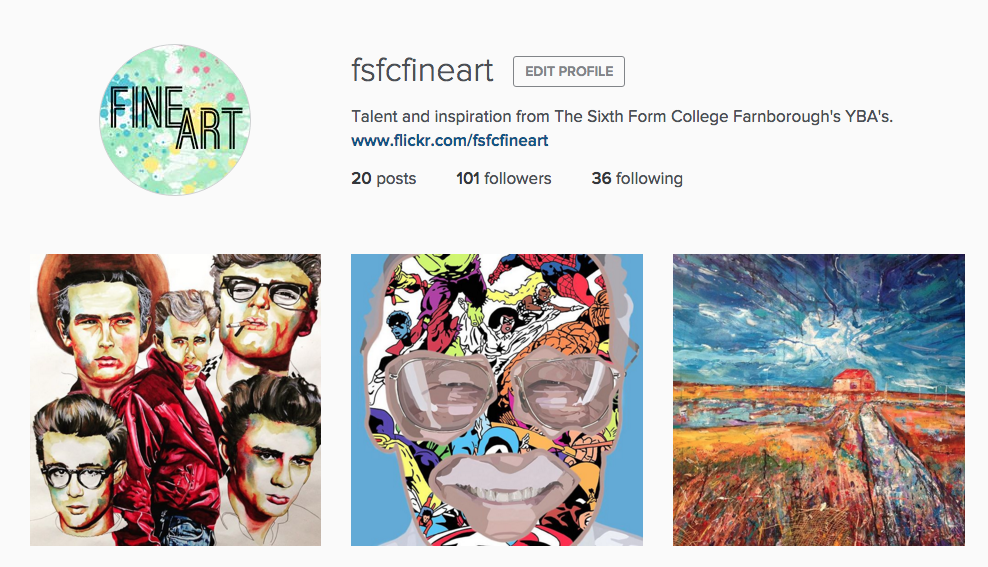
Instagram was initially recommended by one of my students and after a few discussions in class I found that several of my students were already using the social media site for their own publication of artwork and gaining huge successes from it. About three weeks ago, I decided to try a new digital venture for the department and since launching our own page we already have over 100 followers. Our students have responded positively to the site and many have followed us - checking daily to see new ideas from fellow students in both AS and A2. Through hashtags we have been able to create an online following and draw attention to what we want people to look at. For example: #fsfcfineart, #studentartwork #expressivepainting, etc. Our page has also enabled us to find new artists and follow galleries for inspiring artwork for our students. Our students can then click on what we 'like' and within the past week some students have already approached me through our online signposting for artist research!
It makes me incredibly proud to see my students receive the attention they deserve and even prouder to see them independently critique and compliment one another's artwork. In turn, this positive praise gives my students more confidence within the classroom and successfully introduces them to new initiatives and links within the art world.
Now, I won't lie.. the above does take time and we try to post on each social media site at least once a week to keep our audience happy. All of the above sites have an App and once set up it is pretty quick to post something from your phone and access it without a computer. We even have our own QR codes within the classroom for students to access in lessons and we publicise these also on our course leaflets and next to paintings around the college (linking back to our Flickr account).
We'd love to digitally interact with other educational institutions so if you use a digital tool for the promotion of your student artwork then let us know by either following us or leaving a comment on the end of this blog post!
A few months back Claire did a post about monoprinting with leaves and experimenting with using natural forms as resist. I've always loved monoprinting but for some reason my learners have never seemed to of engaged with the technique. For the past 6 weeks I have been teaching my AS Fine Art students a series of creative techniques before they take the plunge into their first project and the following technique captured their imaginations and enabled them to build and draw upon exciting layers!
Over the Summer myself and Claire were super lucky to find this idea on the NSEAD Online Facebook group. If you aren't a member then join - the wealth of resources shared with all levels of art educators is amazing. After a bit of a play with the technique I thought about how I could make it more advance for my students and this is where I experimented with masking tape layers and washes to build up the texture and tone within the print. This technique would work well for any initial responses or as a quick method of recording to change the direction of a project and more importantly all my students relished in getting messy, testing alternative drawing methods and combining medias!
Follow the below steps to give it a go with your classes this month...
What you need:
• Block Printing ink (water or oil based)
• Print rollers
• Acrylic paint
• Masking tape
• Newspaper / Magazines
• Cardboard or any mixed-media base
• Relevant imagery to monoprint / draw on top of
Method:
1) Take your base (cardboard works great as it enables your students to work on top of a new exciting media) and choose a light colour of acrylic paint to work on top of. It is important it is light so that the print and layers you are about to build up stay clear. I told my students to ensure the colour reflected the mood of the image they were studying or you could link it to colour theory. Dry with a hairdryer before proceeding to step 2.
2) Start to build up layers with masking tape - thinking about the direction and scale of strips applied. I taught my students a technique called 'masking tape transfer' to add more depth to their base. To create this technique, simply apply masking tape directly onto any printed image (magazines, newspapers, train tickets, etc work great due to the quality of the ink!). Once stuck firmly down to the image/text - simply peel straight off! You will be left with the ink on the tape and what's great is that the masking tape is still sticky and can be applied straight on top of your base.
3) Apply a thin wash of white acrylic paint on top of the masking tape layer to ensure your print will stand out.
4) Roll your ink on to the back of a printed image (make sure your image is mirrored so it comes out the right way!) and rub off the excess ink with spare newspaper. I used black ink so it made a real contrast to the yellow background layer but you could experiment with single/multiple colour ways! Once you have rubbed the excess ink off, place the inked image face down on top of your masking tape base and start tracing on top of your image with a biro or sharp pencil. Once you have completed your drawing remove the printed image and ta-dah! You have been left with a unique and experimental printed drawing like below.
Tip: Less ink is more and the sharper your drawing implement the better! Biro's are great. My students responded to a variety of mark making techniques and extended their learning by using creative drawing methods such as continuous line and adding tea/coffee into their prints for further use of layers/tone.
As always we'd love to see visual examples if you give this technique a try with your students and if you know any other creative printing techniques then contact us to make a guest blog appearance.
why: having recently become a proud owner to two beautiful cats I wanted to celebrate by adding some artwork to my walls that was cat related and I stumbled upon Andy Warhol's cat series! You can read more about the 25 cats named Sam and one blue pussy, here. I was completely unaware of them before and they make a great link for any students looking at animals for a subject matter as well as being a bit away from the norm for an Andy Warhol reference! Also if you too are into cats and art and happen to be in Amsterdam I fully recommend the Cat Museum, The Cat Cabinet, that's there!
Ever since I got a Tate timeline I've wanted it displayed in my classroom but I wanted it to have a bit more substance than just a stand alone piece. Additionally this academic year I changed workplace wanted to have a fresh set of display pieces to put up so that I knew at least one board could be transformed as soon as moved in. Although I've taught fine art or art and design as part of my timetable over the last 5 years I've been based in and primarily taught Graphics or Textiles so I didn't have many display items ready to go! One of the things I enjoyed about Textiles was the emphasis on colour palettes so I decided to create a mash up of colour theory and art history and so my 'colour theory meets art history' board was created! I selected artists from across the Tate timeline and collated an example of their work (title and dates included), defined their colour palette and the art movement they were associated with.
I created the sheets in Photoshop which was great as I could use the colour picker tool to take colours straight from the painting and drop them into my colour palette! I created 25 examples altogether and to display them place them in chronological order with the Tate timeline running across the middle! I think it's made a pretty good display board and I've found my students interact with it well either looking for examples of colour or asking questions about artwork that we may not have otherwise covered in class! Here it is in all it's glory...
why: Because she uses traditional needlework embroidery to give her work a pixelated look and depicts found text in urban locations to make comments on contemporary social beliefs. I couldn't help but giggle when I saw the above piece 'Like This Post', I love work that references social media in this manner!
why: These portraits are incredible! We can't get over the beauty of them and attention to detail... the video below is well worth a watch as it shows the incredible process that goes into creating these pieces.
I don't know about you but I always find myself continuously racking my brains for innovative ideas of how to successfully embed literacy and maths within the arts. Visual literacy is an area that has always interested me and believe it is a great, creative way to develop student's learning. Recently, for an observed lesson I chucked myself in the deep end and created a starter activity inspired by this fantastic resource from The Photographers' Gallery entitled: What do you see? The concept of the activity is that it is designed to develop learners visual literacy skills by asking them to describe and draw the subject and compositional elements of a photograph. This idea was perfect as I was fortunate enough that my students at the time were responding to primary photographs!
I'm even luckier that most of my classes have a perfect match to work in pairs but if not don't worry - three's can work too. Just double the drawer or the describer up. You can make the activity as long or short as you like - I gave mine two minutes each to describe/draw as I enjoy short and sharp activities!
Step 1. Find a partner
Step 2. Swop your primary photographs with your partner and choose one image you would like your partner to draw - keep it hidden from your partner!
Step 3. Start describing the
photograph to your partner without showing the image. The partner must
try to draw the image based on your description. You may ask questions
of each other, act out poses and look at the drawing together as long as
the photograph is kept hidden.
Step 4. Now, swop and repeat the process.
Step 5. Lay out the drawings next to the photograph and compare them.
The students really engaged with the activity and it was great to see the drawer acting out poses to understand verbal descriptions/instructions! The responses after the activity were all positive and some were surprised at how quickly they could produce a detailed drawing through the use of language. At the end of the activity I got students to respond to three set questions:
1. How do the drawings compare with the original photographs?
2. Did your partner describe any details in the photograph you may not of originally noticed?
3.What descriptive words did you find most useful when listening to instructions?
Feedback from learners was positive and all were able to confidently answer the 3 questions above. Even better, students were able to comment that it enabled them to see parts of the image which they may of not noticed beforehand. For example: texture, line, elements within the back/foreground. After the activity I got my students to continue responding to their primary photographs - making sure they applied the skills they had learnt from the activity to notice every, tiny detail. Some were even repeating the descriptive words to remember how to draw marks!
Overall, I found this activity ensured accurate observation and students understood what they were seeing/drawing which resulted in higher-level critical thinking! We think this activity is great for any art discipline and would work well with paintings/drawings etc as well as photographs. The feedback could even be changed into a critique!
As always let us know if you have tried this activity or have other fun ways of using visual literacy in your lessons. We'd love to hear them!
First of all we'd like to say a massive thanks to Mrs Jo Baker who got in touch with us over the summer to share her wonderful Rothko inspired weave project and has allowed us to share it with you here on the blog. We've mostly only taught at college level so it's always great to hear from teachers in schools and see the different way they do things!
Rothko Inspired Weave Project
1. Students begin the project by researching the work of Artist Mark Rothko
2. They are then set a homework to do a landscape photography shoot! The focus of their shoot is to look for strips of horizontal colours within the landscape (if they can't take photographs they could always look for existing photographs at home! or you could provide some in class just in case!). The students need to bring a contact sheet of the whole shoot and select the 4 best images and print them a little bigger and bring those to the next lesson.
3. In class students work from the photographs to simplify the colours, first starting in colour pencil and then extended into watercolour with the two best compositions.
4. They then gather scraps of material for homework in their chosen colours (you should also provide some in class!) Try and gather a range of interesting textures - fabric, crisp wrappers, carrier bags, threads, twigs, straws, etc!
5. The students use a weave board made out of old mount card. Cut little v's in the top and bottom and wrap string around it in one long piece. There's a cool video tutorial - HERE
6. Students weave in a over and under on one line then under and over on the next - and then repeat! They need to pull the pieces of fabric down really tightly to make sure they get a nice strong piece of textile!
7. Once they've filled the board they are done! They can turn over the weave, cut the string across the centre and secure each end - its a bit tricky so they will need to concentrate as the weave is unsupported until they've tied it all together! Once tied off they can use it in whatever way you want to develop it…
As always let us know if you try this project - we reckon it's an ace way to combine art and textiles and we love coming up with ways to get students to appreciate a bit of Rothko! Enjoy!
- Claire ❤ P.S all ideas, photographs and general awesomeness thanks to Mrs Jo Baker! Check out her Blog or start following her on Twitter!
Today I was lucky enough to get to take my students out on a trip to the Knitting and Stitching Show at Alexandra Palace in London. It's a brilliant event as it combines exhibits of textile art alongside the opportunity to purchase some materials! There's also a bunch of other stuff going on; workshops, fashion shows and there's the opportunity to talk to the exhibitors and people from various organisations and guilds. I had a great time so I thought I'd share some of my favourite bits just incase you're heading off tomorrow or over the weekend...
Exhibitors
My first stop was to see the incredible hand embroidery work of Tilleke Schwarz, I've been a fan of hers for many years so I was thrilled to finally see her work in real life! It is just incredible! I also got the chance to speak to Tilleke herself which was lovely!
I stopped by to looked at the wonderful knit-based jewellery at Max's World and was amazed to discover this knitted axolotl! I immediately purchased the pattern for this! (oh you want one too? here you go! You can buy it online HERE)
I like to stop by and check out the UK Hand Knit Award each year as I was on the stand back when I graduated! The stuff on show was incredible but the ones above were my absolute favourites!
Workshops
The Upcycling Academy (headed by the wonderful Barley Massey of Fabrications) is definitely not to be missed! My students stopped by and got involved and transformed an old t-shirt into a bag (which the sported for the rest of the day!) it's a great cause and they've also put together a wonderful teachers resource pack to inspire lessons. You can download it HERE.
Other
Oh how wonderful! A knitted taxi! Wouldn't it be nice to be driven around in that?
All in all it was a brilliant day and I recommend it if you get the chance to make it over there... if not there's always the Harrogate show, the Dublin show or the London show again next spring! Full details over at Twisted Thread
I love doing observational drawing lessons with students! I studied Drawing at degree level so I particularly enjoy the introduction lesson as I introduce drawing approaches that I have found work for me. I don't know about you but I always find I get a good portion of students who are fearful of drawing and who proclaim 'I can't draw' or something of the like, so I like to do this lesson to warm them up and build their confidence in their drawing skills. Instead of jumping in with a technical approach focusing on perspective I like to introduce a series of activities that focus on training their co-ordination between their hands and eyes. I feel it's a great way to introduce drawing that will lead to a better understanding when they move onto more technical approaches but I also feel there are some students (myself included) who will never use a technical approach because it just doesn't work for them - but they can learn perspective by eye instead!
The image above is from a recent observational drawing lesson I did with students but is typical of the way I structure the session. I like to start with quick studies, I'm talking 30 seconds-2 minutes, before moving on to longer studies and I always use a range of approaches. I like to use contour drawing, continuous line, blind drawing, negative space and wrong hand drawing. I'll normally do quick demonstrations on the white board, smart board, flip chart, what ever I have access too but I also like to refer to artists who use these techniques so I put together the sheet below (available to download from our TES resources, HERE) which shows artists and the techniques used! I normally set students homework to make notes about the techniques in their sketchbooks following the drawing lesson and to do further research on one of the artists.
As always we'd love to here from you if you use similar approaches or if you have a go using ours in the classroom!
- Claire ❤
We've already posted about our A2 exam theme resources and linked to the brilliant ones others have created but let's not forget AS! Above is the video intro we used for AS Graphics which outlines the briefs we're setting and the artists/designers we'd suggest researching for it. Below are some additional resources from a range of fabulous people that we've found online...
You can click through to view all our AS exam 2013 posts, HERE and A2 exam 2013 posts, HERE. We're on Edexcel so that's what we've resourced for but there's a lot of stuff out there for AQA and OCR too andArt2dayandSaatchiare great places to start looking!
- Claire ❤
I love this time of year! For me the exam theme is exciting it's the only time you have a really restricted time period in which to create resources and the key thing that can take a while to decide on, the theme, is decided for you by the powers that be! We deliver A Level Graphic Communication, Textiles, Photography and Fine Art between us so we've got a few resources together to share and we've been hunting around online too to find the best stuff that's out there. For Graphics I love a video intro, I've posted about them before, they are really easy to put together. I created mine straight from the powerpoint I'd already put together by exporting the slides as .jpeg files then placing them into iMovie, adding a bit of music and then you've got something to give the intro a bit of a pop (and a slide for students to pour over and digest a bit slower in their own time!). It also give a quick overview to how we've interpreted the themes and the artists/designers we're looking at in graphics. What I like about the exam unit is that the further you get through it the more resources you can find so I've put together a quick set of links to what I think is the most exciting stuff out there online being shared! Keep checking back to this post as we'll add to it each time we find something new...
You can click through to view all our AS exam 2013 posts, HERE and A2 exam 2013 posts, HERE. We're on Edexcel so that's what we've resourced for but there's a lot of stuff out there for AQA and OCR too and Art2day and Saatchi are great places to start looking!
As part of the teacher session at the Tate Portfolio Advice Day I was also able to visit the current exhibitions at the Tate, including the Turner Prize. I love visiting the Turner Prize, it's always interesting to see the mix of different work on display and mull over who you think might be selected as the winner. This year the nominees were Paul Noble; stunningly detailed drawings, Elizabeth Price; film artist who combines text/music/imagery (at an exceptionally loud volume I might add), Spartacus Chetwynd; a performance artist and Luke Fowler; also a film artist. I'm not a huge fan of film based art, I can't quite pinpoint what it is, perhaps its my attention span, so I was hopeful that Paul Noble or Spartacus Chetwynd might win. Paul Noble was purely because it would have been great for a drawer to be selected and Spartacus Chetwynd because of how incredible crazy the piece was. The picture above is of one of the performance rooms just before some humans came in dressed as what looked like Zebras and put on a puppet show for us, it was fabulous. There's a few different performances going on throughout the time the shows on, you can see a video preview HERE and it's worth checking the performance times so you can be sure to see one when you visit!
This evening was the announcement and I was slightly saddened, though not surprised, that the winner was Elizabeth Price. One of the things I love most about the prize is how unpredictable it is, I can never fathom who is going to win! If you missed the announcement this evening you can catch up with it on 4OD, here. Another thing I love about the show is the pinboard at the end where members of the public can share their views on the show and some people really like to get those opinions out there, these are some of my favourite ones...
The show is open till January 6th so if you haven't visited yet make sure you make it up there, if only to marvel at the performance piece!
why: We love the vintage feel of these mixed media digital collages by German illustrator Marek Haiduk. The way she combines bright colours, geometric shapes and patterns and carefully selected imagery - they are simply stunning!
why: because we love animals and all things vintage looking so this is the perfect combination! We came across the talented Mr. Ryan Berkley on Etsy where he has an incredibly successful shop 'berkleyillustration' which has sold over 30,000 prints since starting up in 2007. So the story goes, Ryan, a self-taught artist started drawing animal portraits in 2006 for an Art Fair. The 'ancestor' themed animal portraits were so popular that it has become a labor of love ever since with a growing army of dedicated followers eager to see what his clever little pencil will draw next. Painstakingly rendered and brilliantly life like it's not hard to see how he has made such a success of his shop. We are even considering buying multiple prints ourselves! Head on over to his shop to see an almighty array of animals from meerkats to sharks!
what: dresses made from maps aka Les robes geographiques
why: we love a good map! Or perhaps it's more that we love anything art-related that uses maps, perhaps they are what we call the ultimate collage material. Anyway, Elizabeth Lecourt constructs these beautiful garments from beautiful maps and we think that her work is wonderful - we're also quite pleased she's a Londoner so we'll be keeping are eyes peeled for upcoming London exhibits! You should also check out her her drawings and handkerchiefs quirky and also beautiful.
why: because these portraits are meticulous in detail, alluring in their high fashion couture subject matter and beguilingly dark and mysterious all at the same time. Serena's work swings wildly from the surreal to the simple with works such as the above 'Search and Destroy' venturing into the fantastical comparing starkly with her 'Black Mirrors' portraits set against an ominous black background. Serena works in pencil crayon, that long forgotten medium now having a revival back to acceptability and combines this with watercolour, ink, gouache, photo transfer and gold leaf to exquisite effect. Her work would be a great introduction to the complexities of the portrait as a subject matter for students and this combined especially considering her chosen media. Check out this interview with Serena on The Block Magazine website for further insight into her artwork.
Just wanted to put up a quick review having ventured off to London Design Festival at the weekend. My original plan may have been a little ambitious - I didn't manage to make it out to East London but I certainly saw plenty! Anyway I wanted to put a post up quickly as although most of the events finished yesterday, one didn't and it was probably my favourite of the day, The Prism. The Prism is a digital installation piece by Keiichi Matsuda, the digital screens are constantly changing as their fed by data relating to London with everything from the Boris bike's to the stock market interacting with it. The result is stunning but one of the best parts about the installation is that it's up in a part of the gallery, behind the scenes, which has never been open to the public. It's like walking around an attic, only it's the attic of the V&A and there's amazing art in it and if that wasn't enough the second part of the tour also includes climbing up a crazy free standing spiral stair case which leads up to the roof of the V&A - the views are stunning and this was an unexpected bonus for me! I was completely blown away - and you can be too! It's open till Friday all you need to do is book online, HERE and it's totally free! I couldn't recommend it more! Don't miss out!
why: because these delicate floral constructs are beautiful fantastical artworks featuring real pressed flowers combined with paper collage giving a real 3D mini garden for your wall! They have that etherial quality that suggests a flower fairy might just be hiding behind a toadstool and remind us of childhood days making daisy chains. Donkelaar, who states that she was 'obsessed with flowers as a kid' has also worked on other interesting projects such as her 'Broken Butterflies' series, where she reconstructs the missing wings of dead butterflies in an equally delicate and charming way. This is something that could easily inspire a nature related project using a mixture of real and found imagery and combining other mixed medias such as drawing or stitching.




%2B2005%2B2006%2BCONTEMPORARY%2BART.jpg)


